
In 2015 I joined EMBL-EBI as a User Experience (UX) Designer for Europe PMC, an open access life sciences literature archive. The role was created because the funders identified a need to improve the user experience of Europe PMC. The team were unfamiliar with UX and it was my job to introduce user-centred design.
This week I’ll be leaving EMBL-EBI . Since 2015 I’ve changed role to Product Manager and then Service Coodinator, responsible for the day-to-day running of Europe PMC and leading the team for 2 years from 2019-2021, until a new Team Leader was appointed. This post covers some of the new ways of working I’ve introduced along the way.
During my first 18 months I carried out several user research studies, engaging with 100 participants in qualitative studies and 455 participants through quantitative studies. I ran a diary study on literature search behaviour and learned a huge amount about different users of Europe PMC which includes life sciences researchers, biocurators, bioinformaticians, information specialists, librarians, funders, developers, policy makers, journalists and members of the public.
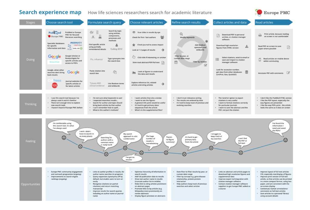
My research generated a lot of new and interesting insights. The challenge was how to share these with the team. In one of my previous roles I ran almost all of my user research sessions with other members of the team observing, including product managers, developers and testers. I like this approach because the team gets to experience users having problems or being confused while using your product first hand. At EMBL-EBI our development team was extremely stretched and it wasn’t feasible to invite them to observe regular research sessions. I had to find other ways to share and communicate my user research findings.
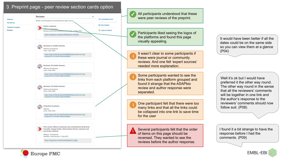
I shared anonymous insights in Slack and presented the findings in team meetings. I mentioned what I’d observed and heard from users often. For usability issues I used annotated screenshots (as below), or a more traditional usability issue log, which is useful for keeping track of which issues have been resolved and linking to relevant JIRA issues.
In 2016 we hired a UX Designer but I continued to take a lead on planning and running user research projects. As I’ll be leaving the organisation, my colleagues were worried about how to tap into insights from previous research studies when I’m gone. In my fourth post in this series I’ll talk more about how I’ve created an insights repository and populated it with insights from previous research, to help share this knowledge with the team.
I became interested in hypothesis based design in 2012 after being introduced to Eric Ries’s Lean Startup book and later Lean UX by Jeff Gothelf and Josh Seiden. I wanted to take a more evidence-based approach to our design work but I haven’t always had the data I needed to validate a hypothesis at my fingertips, which can be frustrating.
Armed only with high level web log statistics like total unique users and requests, I persuaded the team to install a self-hosted version of Matomo (an open source analytics tool) in 2015. We couldn’t afford Google Analytics as our monthly hits way exceeded their threshold of 10 million. Unfortunately an implementation issue meant that I couldn’t segment data by returning vs. new users. But we never seemed to have resource available in the team to resolve the issue. I’ve learned that it’s important to advocate for investing more resources and money into analytics tools.
One way I demonstrated this was to gather data from a user survey which compared satisfaction responses from self-reported regular users of Europe PMC with all survey respondents. The survey data in 2022 showed that satisfaction ratings of regular users had increased more significantly since 2017 than satisfaction ratings for all respondents.
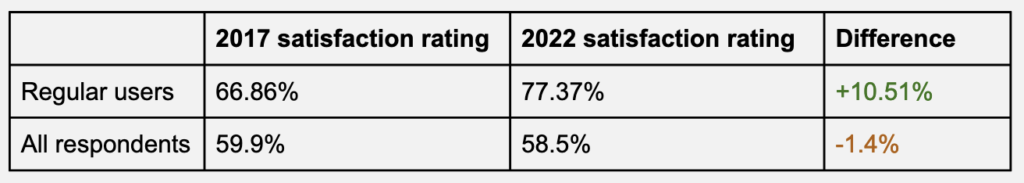
This enabled me to highlight the importance of being able to measure actions by engaged, returning users and compare them to all users, or new users. We now have a strategic objective relating to evaluation and analytics tools. The team is actively working on upgrading and improving the analytics capability.
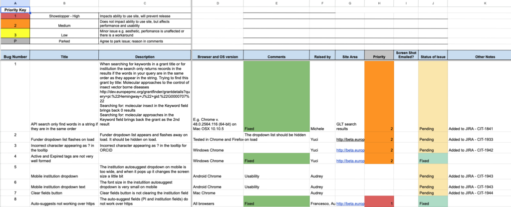
When I joined the team we didn’t have a dedicated tester. Based on my experiences at a previous role, I introduced the idea of a ‘bug bash’ to involve the whole team in testing a feature or major redesign before launch. The bug bash was usually time boxed to 1 hour and I created a Google sheet where the team could log issues and link to screenshots in Google Drive. I made this a fun activity by offering edible prizes for the most bugs reported, which resulted in a frenzy of bug reporting! In 2016 we hired a professional QA who put in place an automated testing framework and automated tests became part of our deployment pipeline. But we continued to run the bug bashes for increased manual testing of new functionality prior to releases.
The developers in the team were mostly unfamiliar with Agile methods when I joined. I’d been working within Agile teams since 2008, so I introduced Agile methods and ceremonies. The team had tried using Agile methods briefly before, but it was met with some suspicion. In particular the idea of reporting what you’d been working on each day in a stand up meeting, which was perceived as micromanaging by some team members.
Sketching, prototyping and diagramming became invaluable tools that helped the team to navigate this change. Europe PMC is a complex piece of infrastructure, serving millions of users each month. Walking the team through different iterations of designs and prototypes and discussing how to implement them surfaced issues about technical scope and complexity early on and generated new ideas, so everyone felt involved. One developer said to me “I really get why we are doing Agile now.”
Another method I like to use which encourages a culture of working collaboratively in the open, is sketching on whiteboards to facilitate discussions in meetings. The idea of visualising concepts and ideas to gain a common understanding of a problem within a team is certainly not new. Jeff Patton talks about reaching a shared understanding by externalising our thinking in his story mapping presentation and excellent book ‘User Story Mapping: Discover the Whole Story, Build the Right Product‘. This approach has helped our team to reduce ambiguity about the problems we were solving and reach agreement on a solution more quickly.
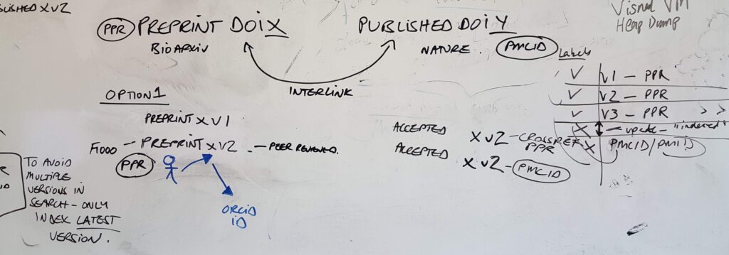
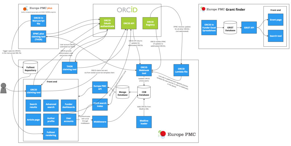
I’m a big fan of diagrams to make sense of complicated systems and I’ve used diagrams to visualise and understand Europe PMC’s technical architecture, data pipelines and many moving parts. I’ve found it useful to ask others in the team to validate diagrams to ensure that they represent reality and make sense to everyone. Diagrams are also useful for knowledge transfer to new starters in the team. For example this diagram explaining Europe PMC’s integration with ORCID, a unique identifier for authors, was used internally and then during a meeting with members of the ORCID team.
In 2016 I took on product management responsibilities and was tasked with creating a public roadmap. I’ll talk more about the roadmap process and how it relates to the vision and strategic objectives in the second post in this series. The team didn’t have a very visible way of tracking their work at a high level. JIRA issues were too low level. I set up a Trello Kanban version of our roadmap for internal use, to provide an overview of all work in progress and work completed.
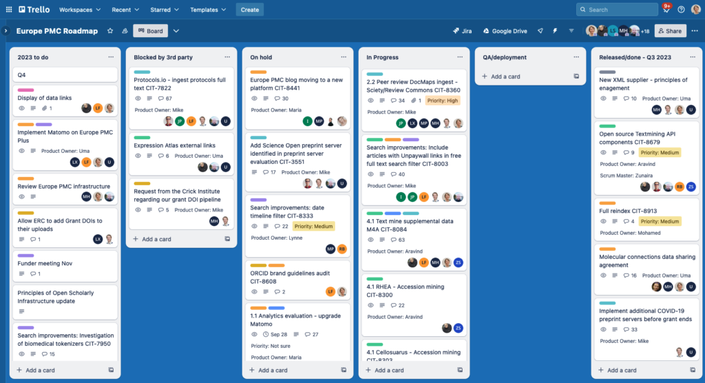
The Trello roadmap enables everyone to visualise work in progress across the whole team. It also makes updating the public roadmap much easier and feeds into biannual reporting to stakeholders. We have a ‘Released/completed’ column for each quarter of the year – it’s always a satisfying feeling to move a card across, as some of our bigger projects can span several quarters. Similarly it provides a useful record for individuals to keep track of their own tasks and work, for 1:1s and annual reviews. We meet weekly to discuss what’s on the Trello board and update it. Each card links to a JIRA board or epic and other key documents and indicates who is the product owner and scrum master.
This post has covered a few of the new ways of working I’ve introduced to my team in the last few years. I’ve covered sharing insights from user research, using analytics data, bug bashes, sketching and diagramming and visualising the team’s work. In part 4 of this series of posts I’ll explore in more detail some of the challenges of formalising and embedding processes and best practices and ensuring that they keep on working well over time.
Comments
2 responses to “Navigating change part 1: introducing new ways of working”
[…] second post in a series about navigating change in my role at EMBL-EBI. In my last post I covered introducing new ways of working to the team. In this post I will cover some examples of how I was able to influence stakeholders and the […]
[…] Introducing new ways of working […]